A good interior design project is like an orchestra that, in order to function and bring a nice result – with a welcoming, functional and beautiful environment – needs to have harmony.
To achieve balance, these aspects must be taken into account: concept, lighting, form, content (fabrics, textures, coatings, furniture) and color.
In this text, we will talk a little more about color.
For the environment to have a pleasant atmosphere, it is essential that there is an adequate distribution of colors. And, believe me, they have the power to help in the good coexistence between the occupants of the property.
On the other hand, if there is an excess of a color or disharmony between the color composition, the environment can become very unpleasant and uncomfortable, one where we cannot stay for a long time and/or make us want to run away.
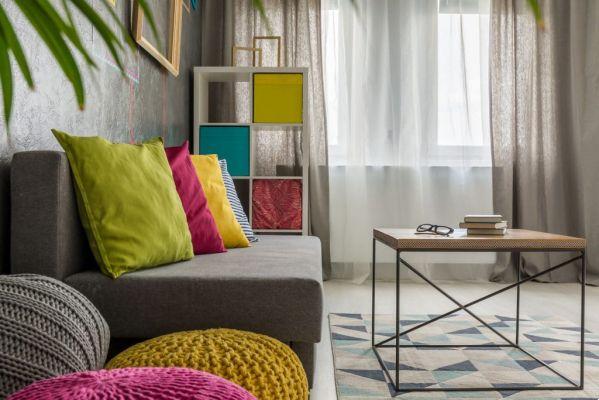
The colors can be on the walls, furniture or decorative pieces, including pillows, paintings, vases, ornaments, etc.
If you are in doubt about the combination of colors in an environment, seek help from a professional. If you can't and/or want to risk it, opt for soft colors, especially on walls and larger furniture, as they tend to saturate with more difficulty. Prefer bright colors in decorative objects, because if you make a mistake it is easier to replace.
Speaking of each color:
White → light and smooth color.
It usually leaves the environment calm and pleasant, however it asks for a color in the composition / in the details. Too much of this color tends to leave the space cold and without dynamism. It is also a color associated with hygiene, so it is interesting to be used in places where food is prepared.
Blue → conveys a sense of comfort in the home; relax and welcome.
In excess, it can leave its inhabitants low on energy and unwilling to move. Great option for the dorm.
Violet → usually conveys luxury and sumptuousness to the environment.
It can be an interesting color to use in the dining room and/or kitchen as it curbs your appetite.
Yellow → brings a happy and relaxed atmosphere to the environment.
It's a great color to brighten up a space and liven up its occupants. Interesting color for family gatherings, such as the living room or the office.
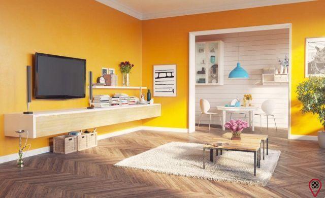
Orange → a very nice color, as it brings a relaxed atmosphere and dialogue between the residents of the property.
Also very cool for family living areas. It is a color that sharpens the palate and stimulates the appetite, so the suggestion is to use it sparingly in the kitchen.
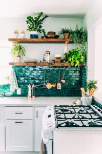
Green → is the color of balance.
It minimizes stress, relaxes and replenishes the exhaustion of the day-to-day rush. However, as its excess tends to leave the environment monotonous and static, avoid using it in all rooms of the house or too much in a single room. Green contributes to good digestion and balance in proper food intake.
Brown → this color conveys a feeling of firmness, security and solidity.
Depending on the composition, it can make the environment very cozy and / or sophisticated. My suggestion: avoid this color in the couple's bedroom, as brown does not stimulate sexual desire.
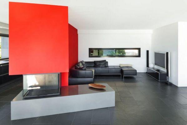
Red → color associated with dynamism, movement and breaking of monotony.
Interesting to be used in a living room and/or office to give vitality. However, it should be used with great caution, because in excess it generates tiredness and exhaustion. Despite being the color of seduction, it is not recommended to use it in bedrooms, especially on the walls, as it is also stimulating and the bedroom is, above all, the place to relax and recharge.
Pink → the color of love – love between a couple and between a parent and child.
It transmits tenderness and affection, so it is recommended to use it in bedrooms, whether to stimulate love between a couple or the affection and care of a mother with her child. It can be used with caution in decorative objects or in bedspreads, pillows and bedding. My recommendation: put a little piece of rose in the boys' room, after all, affection is affection, regardless of sex.
So, have you chosen the color you will use in your home decor?
I particularly love all the colors and I believe they do us a hell of a good deal! My tip: let the colorful invade your home and your life!
Supporting bibliographies:
Book Chromotherapy – The Secret of Colors, Valcapelli, Ed. Life and Consciousness
You may also like another article by this author. Access: Meaning of doors according to Feng Shui